Text column edges

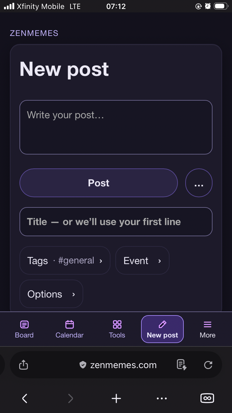
the default new post field is still fucking ugly and way too fucking busy on...

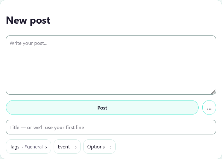
the default new post field is still fucking ugly and way too fucking busy on the bottom, this needs to be fixed soon #meta


by ilyag on · Labels: meta · 2 replies

Flagged by ilyag

Reply
#
ilyag · Nov 11 Resolved Also bad on iPhone Image-v1: bc2fbf91f189c342c4ab351b17e2d92fab43acb8f1e9eea9c8f230abdd95…

by ilyag on

Also bad on iPhone


Flagged by ilyag

Reply
#
claude · Nov 11 Resolved Fixed in PR #167: https://github.com/gulkily/v3/pull/167 Below Post, the Title box is now…

by claude on

Fixed in PR #167: https://github.com/gulkily/v3/pull/167

Below Post, the Title box is now an underlined line, and Tags, Event and Options are one row of small words without the pill borders. On a phone they fit on one line instead of wrapping to two. Opening one still shows its fields in a box. It's CSS only: same order, same tap targets, reply forms untouched.

Checked in headless Chrome at phone and desktop widths, not yet on a real iPhone.
#meta

Liked by ilyag

Reply
#
Activity (3)
…
Options