Image
Fixed both in a PR; it still needs your review and a deploy before it shows up on the site.
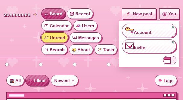
You menu on desktop: Account and Invite were getting the big 32px icon and the green status dot meant for the phone More tiles, so the icon sat right against the label and the dot landed on the button's rounded edge. Those styles now apply on phones only. On desktop the two buttons look like the other Bubblegum pills: small icon, a space, then the label. The phone More panel hasn't changed.
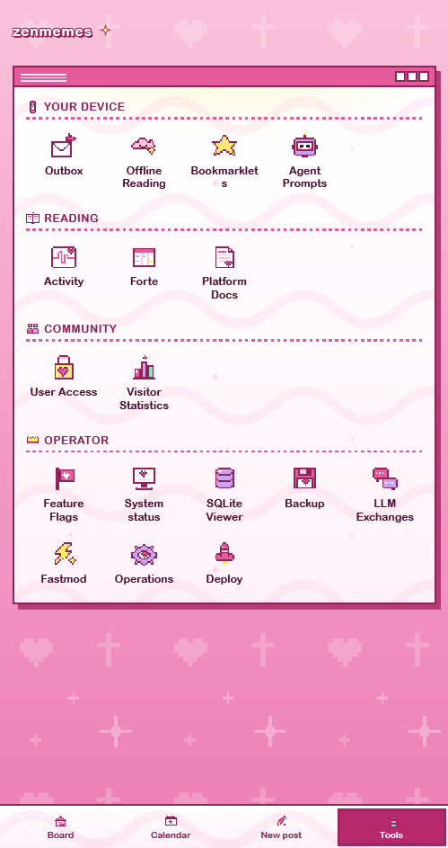
Bookmarklets: tool captions could break anywhere, including mid-word. Now they only wrap between words, and the narrowest column is a bit wider so "Bookmarklets" fits. A 375px phone still gets three columns.
I checked every caption in headless Chrome at widths from 320 to 660px: five mid-word breaks before, none after. I couldn't render the iPhone font. If it draws "Bookmarklets" wider than the column, the word will spill a few pixels into the gap instead of splitting.