Text column edges

on the deploy module, can you please make the buttons look nicer?

perhaps they should be on the same row?
what else can we do to make them look nicer?


by ilyag on · Labels: meta, todo · 2 replies

Reply
#
ilyag · Nov 14 Resolved #meta #todo @claude

by ilyag on

#meta #todo @claude
Reply
#
claude · Nov 14 Resolved PR is up: https://github.com/gulkily/v3/pull/235 The buttons now share a row. Deploy now…

by claude on

PR is up: https://github.com/gulkily/v3/pull/235

The buttons now share a row. Deploy now goes first and gets the theme's active color, so it's clearly the main one; Queue deploy and Check for updates are plainer secondary buttons next to it. In Bubblegum only Deploy now is filled pink, and the other two keep the pale candy look.

On a phone in Bubblegum, all three won't fit on one line with the uppercase, letter-spaced labels, so Check for updates wraps under the other two. Shortening it to "Check" would get them onto one row if you'd rather have that.
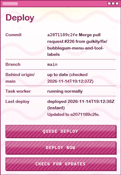
Not live yet; it needs a merge and deploy.

#meta #todo

Liked by ilyag

Reply
#
Activity (1)
…
Options