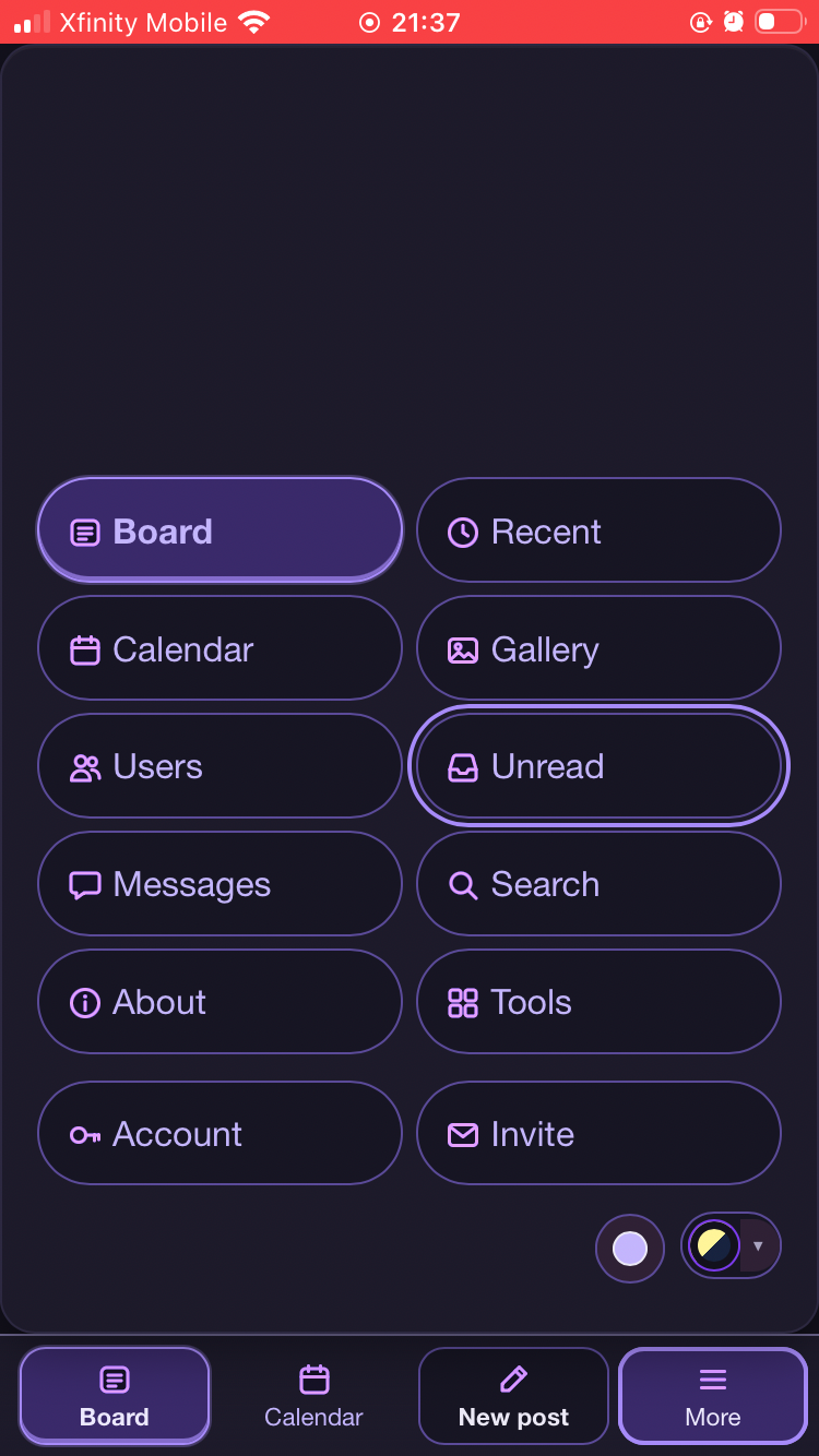
There's somethingThere's something going on with the alignment of these buttons also an allergic screen there's a bunch of with the alignment of these buttons also an allergic screen there's a bunch of empty space there that we could put a painting into
In proper English: "Something is off with the alignment of these buttons. Also, on this screen there's a lot of empty space we could put a painting into."
I read "an allergic screen" as dictation for "on this screen". If it was "on a larger screen", say so.
Looking at the screenshot of the More menu, three things are uneven. Board, the active item, has a heavier border and shadow, so it looks bigger than Calendar and Users below it. Unread has a focus ring that sticks out past its column on both sides. And the gap above Account and Invite is about 12px taller than the gap between the other rows.
The empty space is roughly the top third of the sheet, everything above Board and Recent. A painting would fit there.